AEW
Boxing
PFL
PFL Schedule 2024
UFC
UFC Rankings 2024
WWE
WWE Schedule 2024
WWE Roster 2024
WWE RAW Results 2024
WWE SmackDown Results 2024
Video
Fightline
Home
MMA
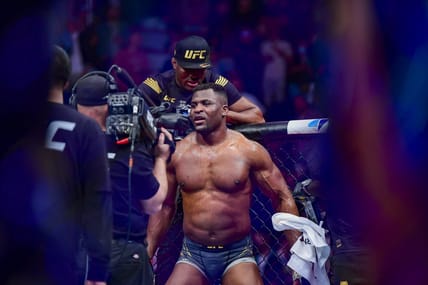
Francis Ngannou ‘Doesn’t Know What To Do’ Following Death Of Infant Son
By
Dana Becker
10 Former and Current UFC Fighters To Appear In Hit Movies, Including Kamaru Usman and Michael Bisping
By
Dana Becker
UFC Vegas 91 Predictions and Betting Odds
By
Anthony Walker
Could UFC Hall-of-Famer Michael Bisping End His Retirement For Trilogy With An Old Rival In Karate Combat?
By
Jason Burgos
10 Former And Current UFC Fighters With Surprising Arrest Histories, Including Jorge Masvidal and Chael Sonnen
By
Dana Becker
EXCLUSIVE: Lucero Acosta Out Of Combate Global’s May 11 Main Event, 9-Time Kickboxing Champ Jumps In As Replacement
By
Jason Burgos
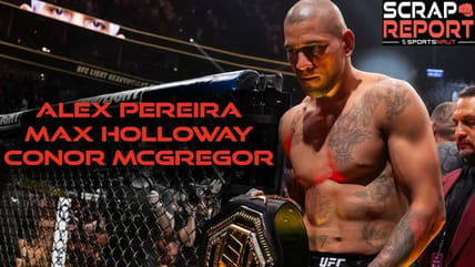
Scrap Report: What’s Next For Alex Pereira and Max Holloway And A 165-Pound Title Fight For Conor McGregor
By
Anthony Walker
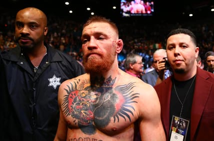
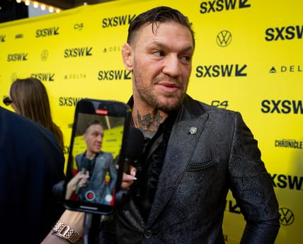
Will UFC Create New Belt For Conor McGregor Return At UFC 303?
By
Dana Becker
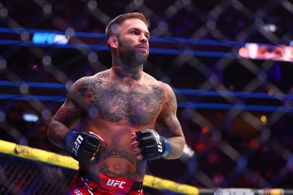
Cody Garbrandt With Another Excuse After UFC 300 Defeat
By
Dana Becker
Holly Holm Excuse For UFC 300 Loss Shows She Needs To Call It A Career
By
Dana Becker
Load More